Here are two paintings that I recently did as demonstration pieces during a visit to Bury St Edmunds Art Society. It’s always a pleasure to visit this enthusiastic group and I think this might be the fourth time that I’ve made the journey down to deepest Suffolk.
My brief was ‘line and wash’, which can encompass many different ways of working. As it’s a speedy medium to work in, or at least it is the way I do it, I managed to fit two paintings into the two hour evening session, although I had to gallop on a little bit towards the end!
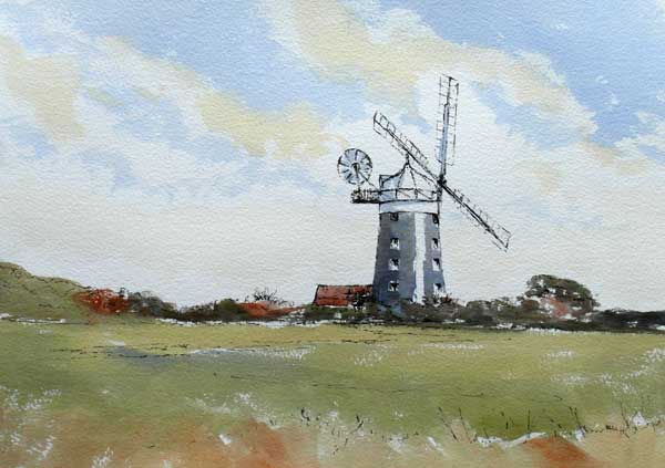
The first is an example of what I would call traditional pen and wash, where the initial drawing is done with a pen and then some simple watercolour washes are applied once the penwork has dried. I used a black Faber-Castell Pitt artist pen for the drawing, with a medium nib. This corresponds to an 0.7 in most other brands of pen.
The drawing is everything in this type of working (actually it probably is in any type of working) so I was careful to observe the line of the windmill and its proportions. It’s not that difficult, but it takes care and thinking about each mark on the paper before making it. I frequently ask myself questions about each line or point on a line, as in”where is point B in relation to point A, where point A is a mark that I consider to be in the right place”. Always take time to step back from your drawing and have a good look at it. Does anything actually look wrong? If so, it’s never going to be right, so correct it while you can. Particularly in the early stages of a drawing this sort of ‘checking’ needs to happen almost constantly.
Once I was happy with the drawing, I applied some quick and simple watercolour washes. For this I used a large flat brush, not the traditional round. As this had to be quite a large painting for a pen and wash, on an A3 piece of Arches 140lb rough paper, I used a 1 inch flat brush, a Rowney Sapphire sable and synthetic mixture. I find the flat brush excellent for quick working because I can cover so much ground with it, to swiftly render skies and foregrounds. But, using the corner and edge of the brush it’s surprising how accurate you can be too.
I kept to a very limited palette of colours, just using French Ultramarine, Burnt Sienna, Raw Sienna and a little Cadmium Yellow Pale. I find that these four pigments will do for almost any landscape subject, although I sometimes change Ultramarine for Prussian Blue which gives a much cooler look to the painting.
Although the painting was a bit larger than the usual pen and wash works that I would do on location, the working method was exactly the same. Do a drawing, hope it hasn’t started raining, and get some paint on it quick!
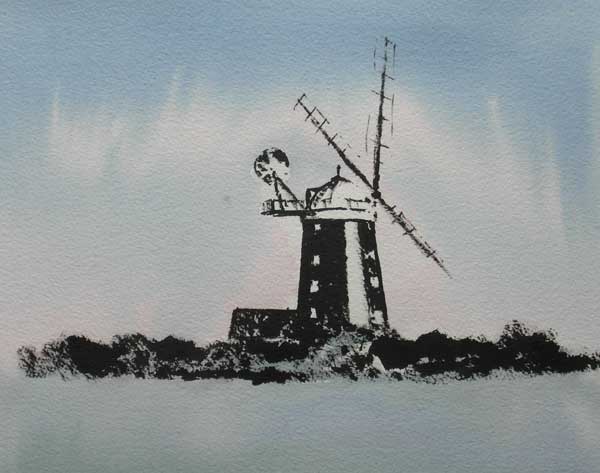
Having a bit of time in hand, I decided to use the same subject again and so a different style of painting, although still beginning with ink and ending with watercolour. I drew the mill using Indian ink from a bottle, applied this time with a small round brush not a pen. The brush was another Rowney Sapphire number 4 round and I went straight in with it without any pencil or pen work. You have to have confidence to do that, and that comes from lots of practice, but I like the immediacy of the strong dark mark. I left a strip of white paper on the tower of the mill, because there was a lot of sunlight reflecting off it in my reference photograph.
By the time I’d drawn in the mill the time was getting on. I rapidly inked in the hedgerow in front of the windmill, using the brush on its side to work it against the rough texture of the paper. A quick dry off with the hairdryer, and I just had time to wash over the paper with some Prussian Blue with a little Permanent Rose here and there to give a feeling of winter light. The whole painting didn’t take much more than half an hour, but I think it’s quite effective and atmospheric. Why not have a go at these techniques, you may well like them!
Finally, my thanks to Olive Smart and all the members of the Bury Art Society who made Margaret and me so welcome. See you again another day!


