October is a time when, over the last few years, I’ve got together with artist friends to stage an exhibition in aid of the Stroke Association’s local group, the Coastal Stroke Support and Carers Group, Hunstanton. I’ve done quite a bit of work with members of this group over the years and it’s been a privilege to see how art therapy can benefit those who have been unfortunate enough to suffer a stroke.
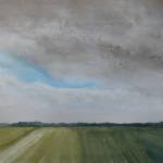
Here are a selection of images of paintings that I will be showing at the Five Painters exhibition, where I will be sharing the space in Thornham Village Hall, Norfolk, with four of my artist friends. This year I have a varied selection of artwork, some new paintings but also some old friends, several of which have never been exhibited before!
The show runs for two days, Saturday and Sunday 5th and 6th October, open each day from 10am until 5pm. Admission is free, although as we will be fundraising please be generous with your donations.


There’s much more to see from all the artists, so do call in if you’re in the area. The hall is on the Main Road at Thornham, North Norfolk, PE36 6LX, just adjacent to the popular Thornham Deli and shop. By the way, parking is free for an hour and a quarter. If you wish to stay after that, you must buy a ticket for the whole duration of your stay.