It’s been a little while since I posted anything from my art club travels, but yesterday morning I was at the Quaker Hall in Beccles, just over the Suffolk border from Nelson’s county of Norfolk. I was invited to give a watercolour demonstration by the Beccles SAA Group, who are a lovely group of artists who meet twice a month on a Thursday morning.
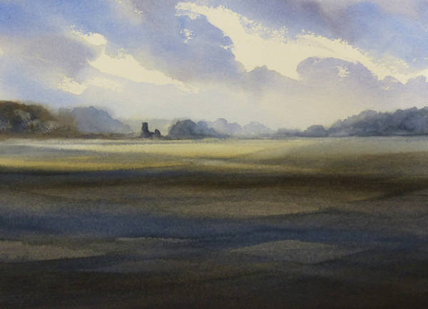
Norfolk fishing Village in the style of Edward Seago. Watercolour on Waterford 140lb rough paper, 22ins x 15ins.
Being on the Norfolk and Suffolk border my thoughts naturally turned to that great artist Edward Seago, who had his home in Ludham, not a million miles away. There is so much to learn from someone of his calibre, and although Seago is perhaps best known for his paintings in oils, I think his mastery of watercolour was almost second to none.
As my demonstration piece I chose a view of a fishing village on the Norfolk coast. I didn’t attempt to make a direct copy of Seago’s original, but simplified the sky to make the painting a bit quicker to do. I worked the sky wet into wet, using MaimeriBlu watercolours Ultramarine Light, Raw Sienna, and Venetian Red. Seago’s original sky, well at least the version I’ve seen, was built up in layers of wet paint on dry paper, which means allowing drying time in between each layer of paint.
A quick pen and wash demonstration. 12ins x 10ins.
Once the sky was on, a few simple washes in the foreground and a little bit of detail on the cottages and boats completed the picture. Actually, it completed it so swiftly that I had a bit of free time in which to just quickly show a few simple pen and wash techniques, using a permanent ink pen and the same three colours I’d used earlier. I did a little bit of pen work to start with using my Staedler 0.7 permanent black pen, then added some very simple washes with a 3/4 inch flat brush. A sketch in every sense of the word, taking around 15 minutes, just as if I was working outside.
The Beccles group made Margaret and myself very welcome and we both look forward to seeing you again at some point in the future. Happy Painting!
Yes, the title of the post sounds confusing doesn’t it? But by a strange coincidence, on the 2nd March 2017 I gave a watercolour demonstration to the a group of artists who meet in the library at the town of March in Cambridgeshire. So, March in March!
Barns in Kent, after Rowland Hilder. 22ins x 15ins on Saunders Waterford 140lb rough paper.
You can see my demonstration painting here. I based the composition on a scene of old barns in Kent, which I found in one of my books about the artist Rowland Hilder. Rowland’s work is really well worth studying for any watercolour landscape artist, as he was a true master of the genre, particularly the landscape in winter. Here, I’ve made the trees a little more summery than Hilder would probably have done, but the palette of colours is fairly typical of his work.
I used MaimeriBlu watercolours for this demonstration, the exact colours being Ultramarine Blue Light, Raw Sienna, Burnt Sienna, Burnt Umber, and Primary Yellow. The Raw Sienna is only used for some warmth in the lower part of the sky, and Primary Yellow was used for the greens, mixed with Ultramarine and a little touch of Burnt Sienna. All the browns, blacks and greys are mixed from Ultramarine with either Burnt Sienna or Burnt Umber. Rowland Hilder often used Lamp Black in his paintings, but I didn’t do that here, preferring to reflect the colour of the sky in all my mixes. Most of the painting was done with a 1 inch flat brush (ProArte sable-synthetic), but the barns and trees were done with a number 8 round brush.
The artists at March were a lovely group and I had a really enjoyable afternoon. See you all again at some point in the future!
Firstly, a very Happy New Year to everyone. May it be full of good painting, good creativity and of course, good health.
To start off the year I thought I’d visit one of the most popular watercolour themes that I get asked about – skies! How to do one, how to work wet into wet, how to add clouds onto dry paper, in short, everything you need to know about skies.
Big Sky Over the Fine City – Norwich. Watercolour 22ins x 15ins.
Recently the SAA (Society for All Artists) asked me to write an article for the January edition of Paint magazine, which the SAA produces every two months. The theme of the article was, yes you’ve guessed, watercolour skies. I was happy to oblige and the magazine was published just a few days ago. If you read the article you will find how to simply and easily produce not just one, but three different skies. In fact I’ve called it my Three in One Sky.
If you’re a member of the SAA you should by now have been sent the January Paint and you’ll find the article on page 6. If you you don’t belong to the SAA then you can read the article on my website from this link Three in One Sky Article. And, if you don’t belong, but would like a copy of Paint, just contact me via my Contact page and I’ll arrange for a copy to be posted to you. Don’t forget to send me your address.
I’ve been on the road lately, visiting two art clubs in the last week or so to do demonstrations for them. And no, I haven’t been to either Ely or York, as the title of this post might imply, these cities have been the subject of my demonstration paintings!
St Mary’s Coppergate, York. Watercolour on Waterford rough 140lb paper, half imperial size.
My first painting was for Deepings Art Club, in the charming little town of Market Deeping just a few miles from Peterborough. My brief here was to demonstrate the painting of a bustling street scene, with buildings, people and vehicles. I chose this view of York, which I’d sketched on a visit to the city a couple of years ago. The church in the painting is St Mary’s, Coppergate.
It was quite a challenge to draw the subject, paint the buildings and pepper it with people, cars and even a bicycle, but I managed it in the two hours of the session. With a bit more time I might have added even more people to the scene, but the main objective was to demonstrate the drawing technique, the use of a limited palette of colours, and how to suggest people and vehicles without putting in too much detail and making the painting too tight. I hope I succeeded and it was lovely to work with quite a small and very interested group. Thank you Deepings, Margaret and I really enjoyed the afternoon!
A Big Sky over Ely. The Cathedral Across the Fields. Watercolour on Waterford rough 140lb paper, half imperial size.
The next stop on my tour was Wisbech in Cambridgeshire, with a demonstration for the Wisbech Art Group on a Friday evening. Actually, although they’re the Wisbech group they meet in nearby Elm, in a very warm and cosy hall called the Elm Centre. I was in a “sky” mood for this demonstration, and this is the resulting painting, with a view across the fields to Ely Cathedral, under a lively sky. I used some Raw Sienna near the horizon to give a glow to the sky and a bit of a feeling of being against the light. The other colours used, all MaimeriBlu watercolour tubes, were Ultramarine Light, Burnt Sienna and Primary Yellow.
I painted the sky in three stages. Firstly a wet-into-wet graduated wash of Ultramarine with a little Burnt Sienna added, blending into the band of Raw Sienna. Then, while it was still damp, I lifted out some clouds with a scrunched up piece of kitchen roll. Finally, once it was dry, I added more clouds with some warm browns and greys as a contrast to the cooler colours of the first wash. Apart from the band of Raw sienna I mentioned earlier, everything else in the sky is a mix of Ultramarine and Burnt Sienna. I worked quickly, using a large (25mm or 1 inch) flat brush of a mixture of sable and synthetic hair.
After a welcome coffee break, I added the cathedral and the foreground, still using the large flat brush. The greens in the foreground are mixed from Ultramarine, Burnt Sienna and Primary Yellow. finally I refined the shape and structure of the cathedral with a No. 8 round brush and a fairly strong mix of, yes you guessed it, Ultramarine and Burnt Sienna.
A lovely group of around thirty artists, all very friendly and interested. Thank you Wisbech, we had a great evening!
For those who are curious, I used the excellent MaimeriBlu watercolour paints for both these demonstrations, and my surface was a half imperial size (15 ins x 22ins) piece of Saunders Waterford rough paper at 140lb or 300gsm weight. My brushes are Daler-Rowney Sapphire sable-synthetic mix, or squirrel hair mops. All these materials can be obtained from the SAA, at saa.co.uk
Barn and Boat, Thornham. 15ins x 11ins on Waterford 140lb NOT paper.
It seems to be art club demonstration season this week. Skegness yesterday evening, Downham Market this evening and Norwich on Thursday. No rest for the wicked artist!
My brief at Skegness was pen and wash, which is a very enjoyable medium to work in. Do a drawing using a waterproof ink pen, and then apply some simple watercolour washes. You can see the result here, where I used an 0.7 Edding 1800 pen and a few Maimeri colours, mainly Ultramarine Blue Light, Raw Sienna and Burnt Sienna, although I couldn’t resist using the dramatically named Dragon’s Blood for the roof tiles on the barn.
Burnham Overy mill. Indian ink and watercolour. 15ins x 11ins on Arches 300lb rough paper.
Pen and wash is a quick medium, the great thing is to not do too much, particularly with the paint. I had it finished in an hour which just allowed me time to do another painting, this time using Indian ink applied with a brush. For this technique you really need a subject that makes a strong statement, such as this windmill against a sunset sky. I applied the ink with a number 4 round brush, a sable-synthetic mix, with no preliminary drawing. Just two colours of paint were used, Maimeri Prussian Blue and Dragon’s Blood.
For both of these paintings I used a large 1 inch flat brush to apply the watercolour, to discourage any fiddling. It’s amazing how much you can do with a big brush like that, it is a very versatile implement and keeps your work nice and free. Paintings like these are quick and fun to do, why not have a go!
Back in December I posted a couple of my recent paintings and mentioned about planning sketches as a means to making the painting process easier and less wasteful of time, paper and paint.
Rummaging around in my studio this morning I came across a pile of planning sketches and thought “I never did get round to writing about these!” So, here are three of them.
Pencil planning sketch of a boat at Thornham, NorfolkA Norfolk farm, complete with pig!Another small pencil sketch, this time of Ely Cathedral
The whole idea of a planning sketch is just that, to plan how the painting will go. The three essentials of any painting are composition, tonal value and colour. By working quickly in pencil I can establish where objects will go, in other words the composition, and I can establish what will be light, dark and mid-toned. A good range of tonal values is essential to creating an eye-catching painting.
I suggest that, like me, you use a soft pencil for these sketches, say a 4B so that you can quickly shade in areas of tone. Any old piece of paper will do, I often use off-cuts of mount-board from my picture framing. The most important thing is not to work too large, as you’ll get bogged down in detail. Remember this is just a plan, so work small and work quickly. That way you can do several sketches until you find the composition and tonal value that looks the most exciting. A couple of useful things to keep in mind are “no bigger than postcard size, and no longer to do than ten minutes”.
I think if you practise making these small sketches before you start to paint, your work will soon go to a new and higher level. you will find that the only decision that remains to be taken is what palette of colours to use, which I will cover in another post. My last tip is, when you’ve got a great looking planning sketch make sure that you keep to that plan when you paint. It sounds easy but your concentration can soon lapse. Keep to a great plan and you’ll make a great painting!
Clouds, shadows, light. Three words that mean a lot to a landscape artist. Here are two new paintings that I’ve made in the last few days, which feature those three motifs.
Shadows Within Shadows. St Felix, Babingley. Watercolour 15ins x 11ins.Walking the Dogs, Thornham. Watercolour 15ins x 11ins.
Although the works look quite different they both use clouds and the varying light in the sky to draw the eye deep into the composition. The aim is to lead the eye on a journey, from the foreground to the focal point and from the focal point into the distance. In both paintings the dark shadows of the foreground act as a lead-in for the eye, pushing you through to the focus. On the one hand the little ruined church of St Felix at Babingley which is just a few miles from my Dersingham studio, and on the other the figures on the beach, with a couple walking their two dogs.
With careful use of devices such as cloud shadows cast over the landscape, it’s possible to turn the simplest of compositions into the powerful and atmospheric painting. When that is coupled with the beauty of fluid watercolour washes some people might regard the end result as some kind of ‘magic’. But it’s not, it is all about carefully thinking through the painting process and making a well judged plan before you start to paint. Often, to help the process, I make small pencil planning sketches to work out the composition and the areas of light and dark. I’ve talked about this before, but in my next post I will show you some of these sketches and talk about them some more. Enjoy your painting!
Here are two paintings that I recently did as demonstration pieces during a visit to Bury St Edmunds Art Society. It’s always a pleasure to visit this enthusiastic group and I think this might be the fourth time that I’ve made the journey down to deepest Suffolk.
My brief was ‘line and wash’, which can encompass many different ways of working. As it’s a speedy medium to work in, or at least it is the way I do it, I managed to fit two paintings into the two hour evening session, although I had to gallop on a little bit towards the end!
A traditional pen and wash painting of Burnham Overy windmill. Arches 140lb rough, A3 size.
The first is an example of what I would call traditional pen and wash, where the initial drawing is done with a pen and then some simple watercolour washes are applied once the penwork has dried. I used a black Faber-Castell Pitt artist pen for the drawing, with a medium nib. This corresponds to an 0.7 in most other brands of pen.
The drawing is everything in this type of working (actually it probably is in any type of working) so I was careful to observe the line of the windmill and its proportions. It’s not that difficult, but it takes care and thinking about each mark on the paper before making it. I frequently ask myself questions about each line or point on a line, as in”where is point B in relation to point A, where point A is a mark that I consider to be in the right place”. Always take time to step back from your drawing and have a good look at it. Does anything actually look wrong? If so, it’s never going to be right, so correct it while you can. Particularly in the early stages of a drawing this sort of ‘checking’ needs to happen almost constantly.
Once I was happy with the drawing, I applied some quick and simple watercolour washes. For this I used a large flat brush, not the traditional round. As this had to be quite a large painting for a pen and wash, on an A3 piece of Arches 140lb rough paper, I used a 1 inch flat brush, a Rowney Sapphire sable and synthetic mixture. I find the flat brush excellent for quick working because I can cover so much ground with it, to swiftly render skies and foregrounds. But, using the corner and edge of the brush it’s surprising how accurate you can be too.
I kept to a very limited palette of colours, just using French Ultramarine, Burnt Sienna, Raw Sienna and a little Cadmium Yellow Pale. I find that these four pigments will do for almost any landscape subject, although I sometimes change Ultramarine for Prussian Blue which gives a much cooler look to the painting.
Although the painting was a bit larger than the usual pen and wash works that I would do on location, the working method was exactly the same. Do a drawing, hope it hasn’t started raining, and get some paint on it quick!
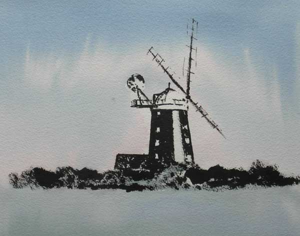
Indian ink and watercolour painting of Burnham Overy windmill. Arches 140lb rough, A3 size.
Having a bit of time in hand, I decided to use the same subject again and so a different style of painting, although still beginning with ink and ending with watercolour. I drew the mill using Indian ink from a bottle, applied this time with a small round brush not a pen. The brush was another Rowney Sapphire number 4 round and I went straight in with it without any pencil or pen work. You have to have confidence to do that, and that comes from lots of practice, but I like the immediacy of the strong dark mark. I left a strip of white paper on the tower of the mill, because there was a lot of sunlight reflecting off it in my reference photograph.
By the time I’d drawn in the mill the time was getting on. I rapidly inked in the hedgerow in front of the windmill, using the brush on its side to work it against the rough texture of the paper. A quick dry off with the hairdryer, and I just had time to wash over the paper with some Prussian Blue with a little Permanent Rose here and there to give a feeling of winter light. The whole painting didn’t take much more than half an hour, but I think it’s quite effective and atmospheric. Why not have a go at these techniques, you may well like them!
Finally, my thanks to Olive Smart and all the members of the Bury Art Society who made Margaret and me so welcome. See you again another day!
A selection of MaimeriBlu watercolour paints, showing the Italian pigment name and, underneath it, the English one in, unfortunately, very small type.
Yes, what indeed does make the perfect tube of watercolour paint? Is it the consistency, with lots of juicy pigment? Is it the ease with which the colours mix and flow? Or, is it the colours themselves, that ‘must have’ shade of red, for example?
Well, all these things are important of course. Lately, I’ve been testing a range of Italian watercolour paints – MaimeriBlu. Some of you may know the name, they’ve been around for a long time, but lately they have not had much presence in the UK. Now the SAA (Society for all Artists) are going to distribute them and several of the Society’s PAs (Professional Associates) have been asked to take a look at the Maimeri range, myself included.
So, how did I find them and have they got that perfect tube of watercolour paint? They certainly have plenty of pigment, and the colours flow out nicely. Some of the colours in the range may not be particularly familiar to UK painters, but that is no disadvantage as all the ‘staple diet’ colours are here, Ultramarine Blue, Burnt Sienna and so forth. Without a doubt these MaimeriBlu watercolours are every bit as good in quality as any other range I’ve tried and I’ve tried quite a few.
But, they have only one little problem. I can’t read the name of the colour on the tube! And actually, Maimeri are not the only ones guilty of this sin, the colours in the latest range of Winsor & Newton Professional Watercolours are equally as difficult to identify quickly. Don’t they know that all watercolour artists are old codgers like me who can’t read tiny print on a tube of paint! So I’m on the look out for a range of paints with nice clear marking on the tube, so that I know straight away whether I’m going to use Ultramarine Blue or Cobalt Blue, or whatever. At the moment, Daler Rowney are in the lead, but I was actually very happy with Winsor & Newton – before they decided to ‘update’ their packaging. I don’t know, grumpy old man!
The initial pen drawingA few simple washes go on, with a big brushThe finished painting of Cley mill, Norfolk
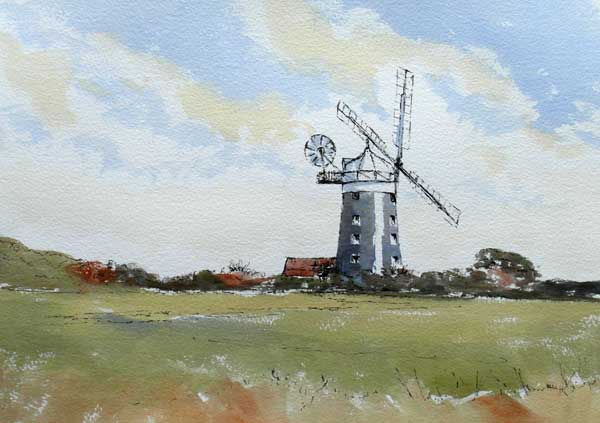
I’ve been working on pen and wash as a medium with one of my students. It’s a lovely way of using watercolour and is ideal for outdoor sketching.
The first stage is to get out a waterproof ink pen, such as an Edding 1800, and sketch out the subject. You can put in as much or as little detail as you wish, but the drawing must be tolerably accurate, in other words nothing must actually look wrong! With a subject like this one, the iconic Norfolk landmark of Cley-next-the-sea Windmill, that takes a bit of care and patient working.
Once you are happy with the sketch it’s time to put some simple watercolour washes on. I use a limited palette of colours and try and apply them freely with quite big brushes. For this painting I used a 3/4 inch flat brush, a Daler-Rowney Sapphire (a sable and synthetic mix) and a number 8 round brush from the same Sapphire series. I’ve always found these to be excellent brushes at a reasonable price, but there are plenty of other good ones from the major manufacturers, such as Pro Arte series 101.
Using a biggish flat brush as much as possible stops most of the dreaded fiddling, and it’s surprising how accurate you can be using just the corner of the brush. The colours I used were French Ultramarine Blue, Raw Sienna, Burnt Sienna and Light Red. Oh, and a tiny touch of Scarlet Lake for the tail-sail which has distinctive red flashes on its sails.
I try to leave bits of white paper here and there to give some life and sparkle to the painting and work everything very simply, relying on the pen drawing to hold it all together. Why not have a go, you will find it a quick and easy way of capturing quite detailed scenes.